
By this point, we’re all familiar with the anatomy of a website: from the URL on down to the navigation menus and footer, the look and feel of any number of websites is something most of us experience every day. But what makes one website create more conversions than others?
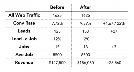
More website conversions equate to a greater number of leads and jobs, which typically means a greater amount of revenue to your bottom line.
More website conversions equate to a greater number of leads and jobs, which typically means a greater amount of revenue to your bottom line.
We’ve already spent lots of time on our blog, during our webinars, and on the most recent episode of our new podcast talking about the importance of a high quality website. Today, we’ve identified five key factors that make a website “high conversion,” or one that produces good, quality leads.
1. Responsive and Mobile Site Behavior
As uncertain as 2020 has been, there is one thing that is certain: with our high expectations for user experience and design aesthetics these days, the responsive behavior and mobile experience of your website needs to be seamless, especially considering our ever-increasing reliance on mobile devices for all of the tasks we complete throughout the day.
Think twice about features, functionality, or design elements that will harm mobile performance. (Are buttons finger friendly? Is your phone and email clickable? Are your forms optimized for mobile? Does your spam filter work?) One of the biggest design oversights when building a site is that people forget there is no hover on a touch screen, so clickable elements need to be obviously clickable without an effect that’s only visible when a mouse hovers over. If you still have a mobile site that’s separate from your primary site, you’re doing it wrong (sorry, but it’s the harsh truth!).
2. Intuitive Navigation and Architecture
Intuitive navigation and architecture isn’t just about having a main menu listing every service or making your phone number huge in the header—it’s about making all the important information, including contact details, hours of operation, your service area, and how to schedule an appointment or fill out a contact form, easy to find and easy to use.
In our new (well, not so new anymore) low-touch world, users are even less inclined to engage with companies they can’t easily connect with. This renders applications such as live chat, online booking, 24/7 answering services, pricing calculators, virtual estimates, and other means of digital communication more important than ever. Not only do you need to have these low-touch means of communication for customers to engage with, but they have to work well, too—or it’s best not to have them at all. (No pressure.)
Ask yourself if your website navigation is intuitive and allows the user to easily orient themselves and move around your website.
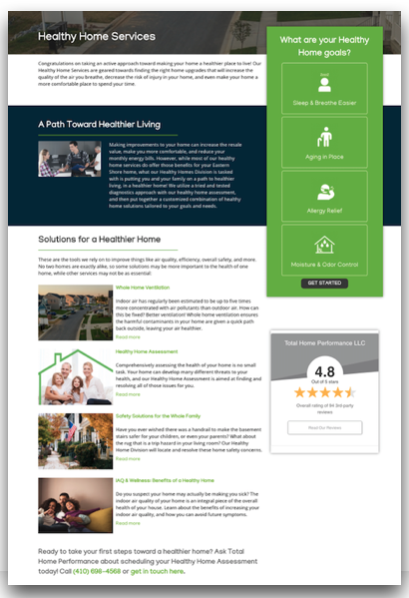
3. Prominent, Relevant Calls to Action
Calls to action (CTAs) are essential to a website for strong conversion as they contain, condensed into one area, both the message and the prompt your customers need to follow in order to complete a conversion: request service, fill out a form, or click through to make a phone call. It should be clear on every page that this is the primary action that you want the website user to take. It’s fine to have multiple options, but consider the website hierarchy—there should be one priority and ideally it’s more specific than just “Call Us.” Instead, it could be “Call to Schedule your Furnace Cleaning Appointment today,” or “Contact us for a free same-day estimate on your new AC install,” or “Click here to download our Winter Readiness Guide.”
The more specific the CTA, the better quality leads you’ll receive because users will be very clear on what to expect if they take the requested action. Other ancillary actions are fine, but they shouldn't distract from the priority action. Make sure these options are small, and group them together in a section further down the page. Be clear that these are secondary options, and what the user should expect. For example: “Not ready to schedule an appointment just yet? Here are some other resources you might find helpful…”
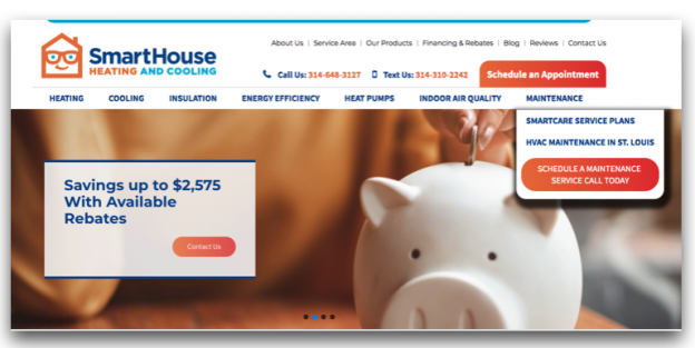
This contractor website exemplifies a direct, prominent, relevant call to action.
4. Internal Linking
Internal linking is more valuable than you may think—it’s not just about adding hyperlinks to your text, and it’s not just about upping your SEO game. Internal links help users remain on the site, even if they’re not ready to convert the moment they land on a page. Featured content blocks on the homepage—linking to other pages on the site—offer options for users to browse other services or read blogs, case studies, and testimonials if they want to explore your site content further. Linking to related blog posts and case studies or related service pages can work to improve your SEO by demonstrating the robustness of your content on a certain topic.
These resources also serve as an opportunity to answer questions or educate users. You don’t need to trap people on a landing page with no navigation to force them to convert on your site. Instead, think of your entire site as one big “trap” (the good kind of trap!) that offers users multiple opportunities to visit pages, educate themselves, and convert to a lead with willing enthusiasm.
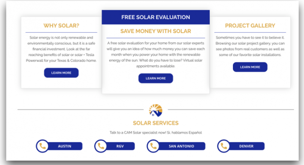
Internal linking isn’t just for hyperlinks! It can also include featured content and content blocks calling out relevant internal resources.
5. Content First, Design Second
As we say at Energy Circle, Content is Queen. Whenever possible, the design of your website should be used to enhance the display of your site’s content, as content serves way more purposes than just encouraging users on your site to convert. It’s important to SEO, to pay-per-click advertising (your Google Ads’ Quality Score depends on your landing page quality, and the average cost of conversion is influenced by that Quality Score, for example). With these factors in mind, it’s not a good idea to sacrifice important, quality content (yes text and words but also images, videos, graphics, and other resources) for the sake of design.
In terms of your design, you’ll want to focus design resources on website navigation, calls to action, and highlighting key information such as pricing, rebates/financing, answers to questions, important information, and processes. Scannable lists and embellishments help lead the eye through the page, and you want a persistent or “sticky” header with website navigation and business contact details. Make sure that your web forms, chat, and scheduling functions are accessible, too—an important factor that shouldn’t be overlooked even if it’s not flashy.
Your design should enhance the display of your content and emphasize scannability.
Some less important design embellishments that are not as effective at driving conversion, but are “pretty” or “sleek,” include interactive functionality like cards flipping, expandable or collapsible panels, and animations or effects upon scrolling or hovering. Large, sweeping, high-res imagery can be impressive and look great, but it can also impact your performance or slow down your page load speed. Ditto with “minimalist” design that’s sometimes called “clean” or “sophisticated.” Although this design style can be compelling, some services, products, or processes simply require a little more explanation—and that’s fine. Strategic use of white space and design embellishments should be employed first to achieve a “clean” or “modern” feel before you go straight for cutting out valuable helpful content.
If you’ve realized that your website needs work if it’s going to help drive more leads and grow your business, you’re likely wondering whether this is a DIY job you can handle yourself or if you need assistance. After asking yourself those questions, you’ve likely come across plenty of websites talking about how easy it is to build your own website. In our next blog, we’ll tackle that question directly, so you can compare and contrast DIY vs. managed websites for your HVAC, home performance, or solar business.